PAWS of Austin
Role: UX Researcher | UX Designer | UI Designer
Project type: Website redesign
Responsibilities: User research, competitive analysis, user flows, wireframing, prototyping, usability testing, and visual design
Tools: Figma | FigJam | Google Docs
Duration: 4 Weeks
PAWS of Austin is an animal rescue shelter specializing in Great Danes. It’s focused on providing refuge to stray and unwanted companion animals in Austin and the surrounding areas. They concentrate on promoting public awareness regarding animal welfare issues, pet healthcare, disaster preparedness, and most importantly, the necessity of spaying and neutering.
The objective of this case study was to enhance the user experience and effectiveness of Paw of Austin's website, to increase donations, streamline the adoption application process, and improve overall engagement.
Before
Background and Introduction
Our first steps were to research the PAWS of Austin website and similar sites. We used this information to focus our problem statement and create a user persona.
This organization plays a vital role in animal rescue and adoption, so it’s essential that their website provides a seamless user experience.
The Paws of Austin website serves as a hub for information about their mission, available pets for adoption, and how the community can get involved. The primary audience includes potential adopters, volunteers, and donors.
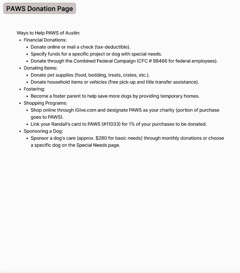
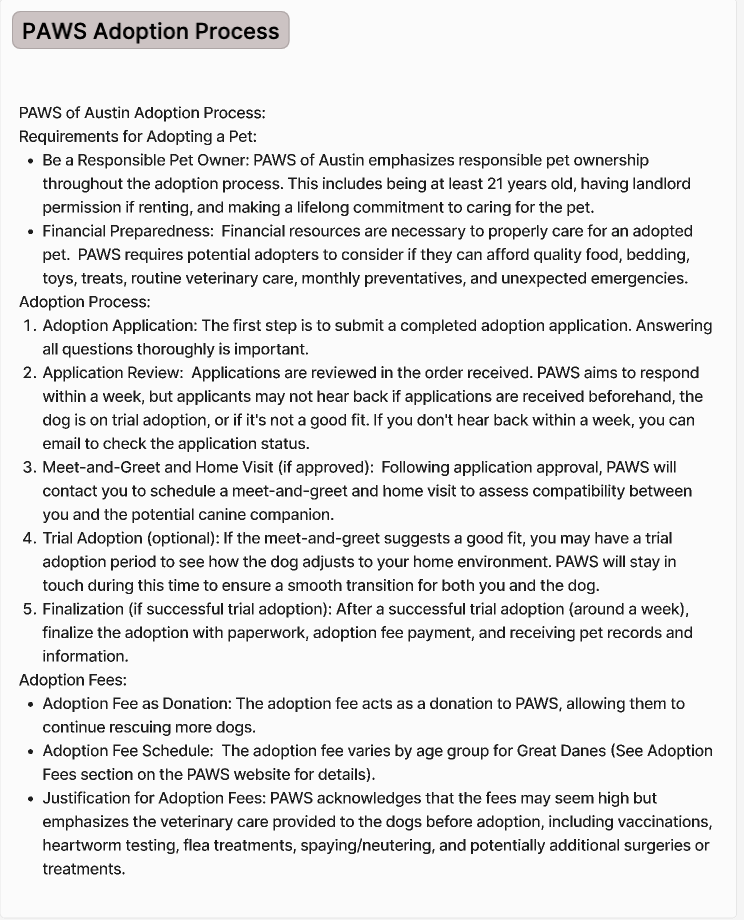
The goal of the website redesign to make it easier for visitors to the site to adopt or to donate.
Visitors to the site can quickly get information for foster info, adoption and donations.
The Paws of Austin website is a fantastic resource for animal lovers and advocates, but there’s always room for improvement. By addressing these usability, design, and accessibility issues, we can create a more effective platform for connecting pets with their forever homes.

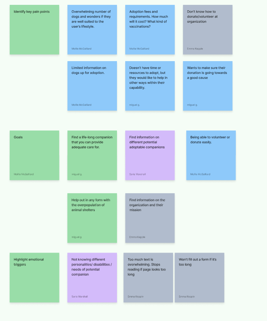
Define the Problem
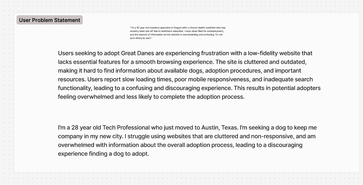
Users seeking to adopt Great Danes are experiencing frustration with a low-fidelity website that lacks essential features for a smooth browsing experience. The site is cluttered and outdated, making it hard to find information about available dogs, adoption procedures, and important resources. Users report slow loading times, poor mobile responsiveness, and inadequate search functionality, leading to a confusing and discouraging experience. This results in potential adopters feeling overwhelmed and less likely to complete the adoption process.
The website is dated. It is non-responsive and non-functioning on mobile. The content is bloated and confusing.
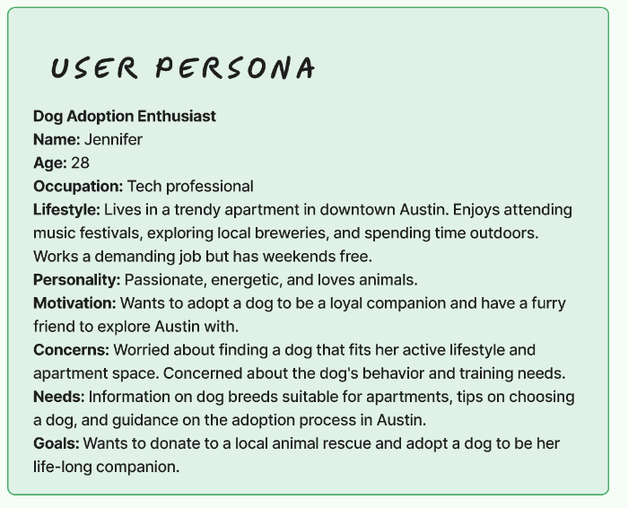
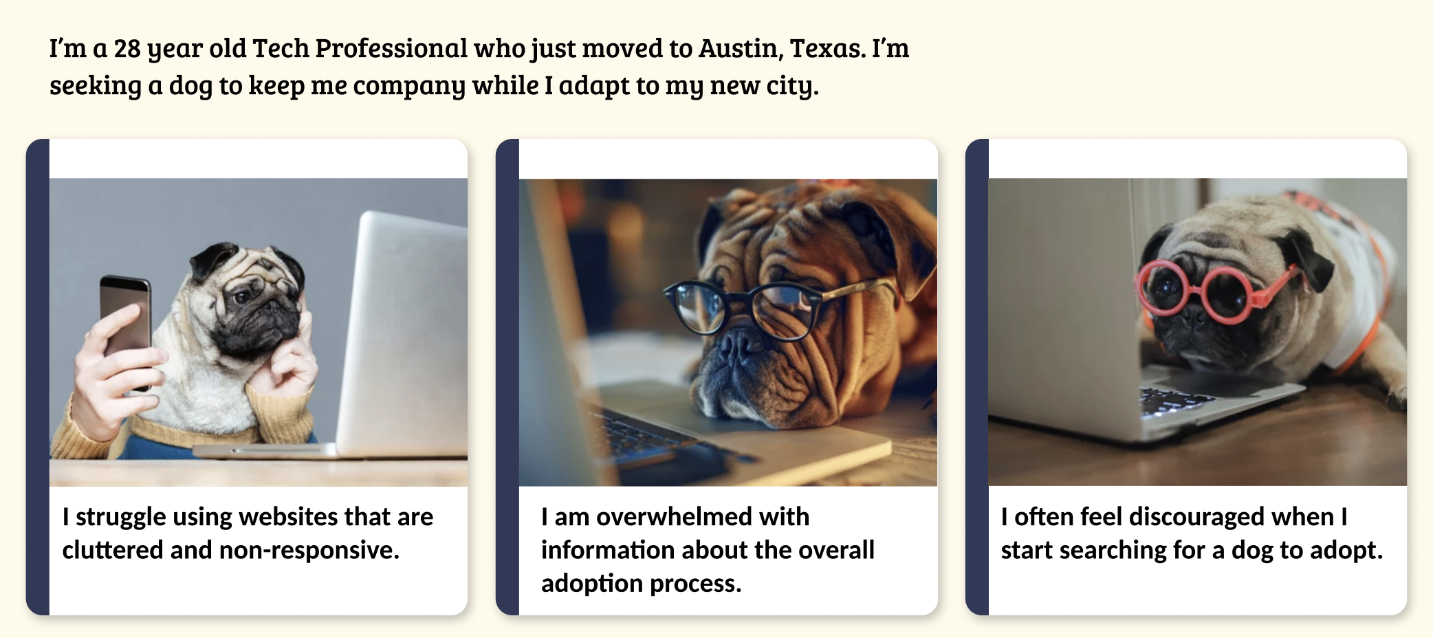
As a potential pet adopter, I want to easily browse available animals for adoption on the Paws of Austin website, so that I can find a suitable companion. I need clear information about each pet, including their age, breed, temperament, and adoption requirements, along with high-quality photos. Additionally, I want a straightforward process to submit an adoption application and access resources about pet care to ensure I’m prepared for pet ownership.
Diverge & Converge
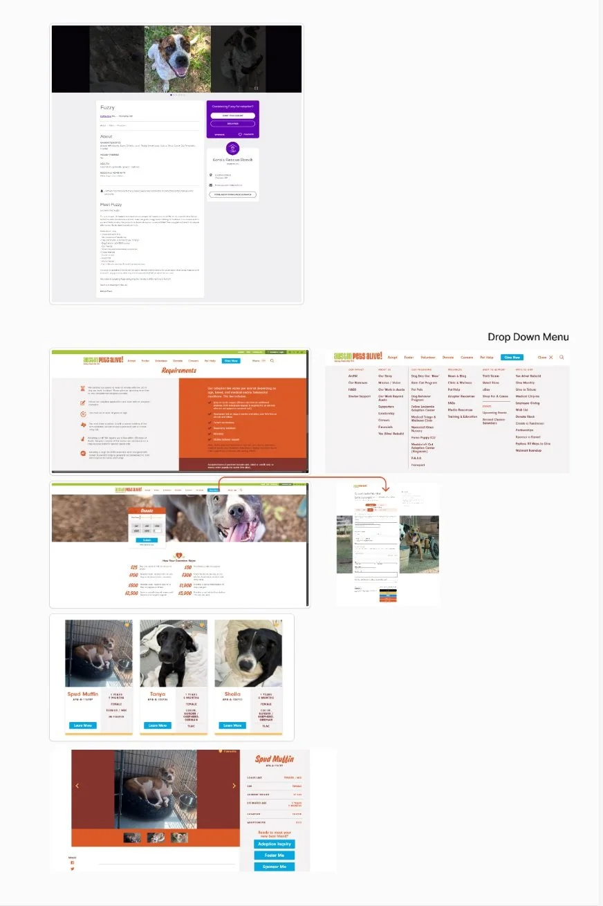
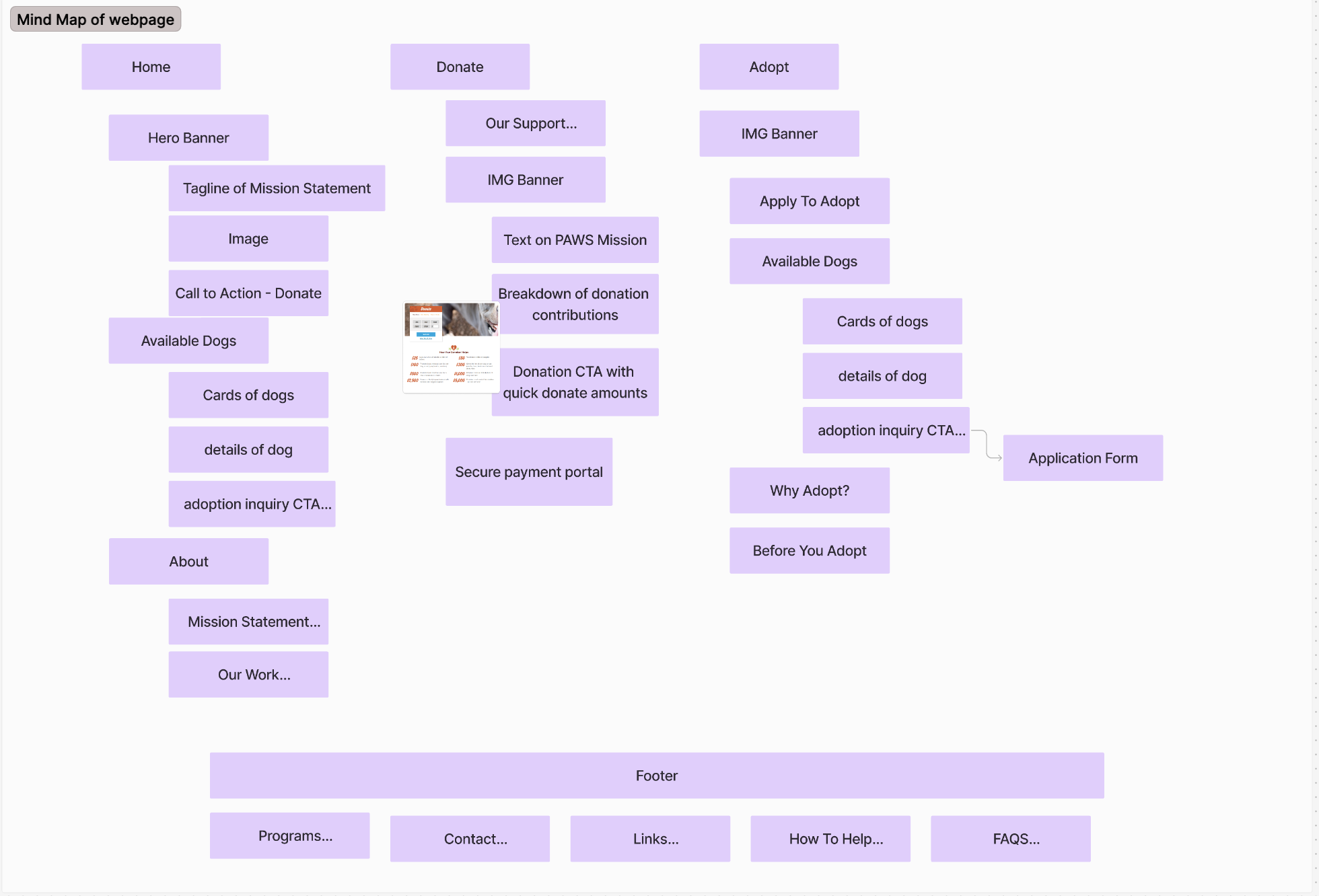
Using other shelter sites as a resource to determine the industry standard, my team collaborated to build the mind map for the redesign.
The mind map helped us organize our thoughts and develop solutions to the problems on the original site.
We concluded that some sections felt crowded. Increasing whitespace could help guide users’ focus and improve content legibility."
The site uses multiple font styles, which can create a disjointed visual experience. A more consistent typography choice would improve readability and cohesion.
While many images have alt text, ensuring all images are appropriately tagged is vital for visually impaired users.
Some text on colored backgrounds lacks sufficient contrast, making it difficult for users with visual impairments to read."
Regular updates about events and success stories could keep the content fresh and engaging.
Call-to-Actions (CTAs): Enhancing the visibility and clarity of CTAs could guide users more effectively toward actions like adopting or donating."
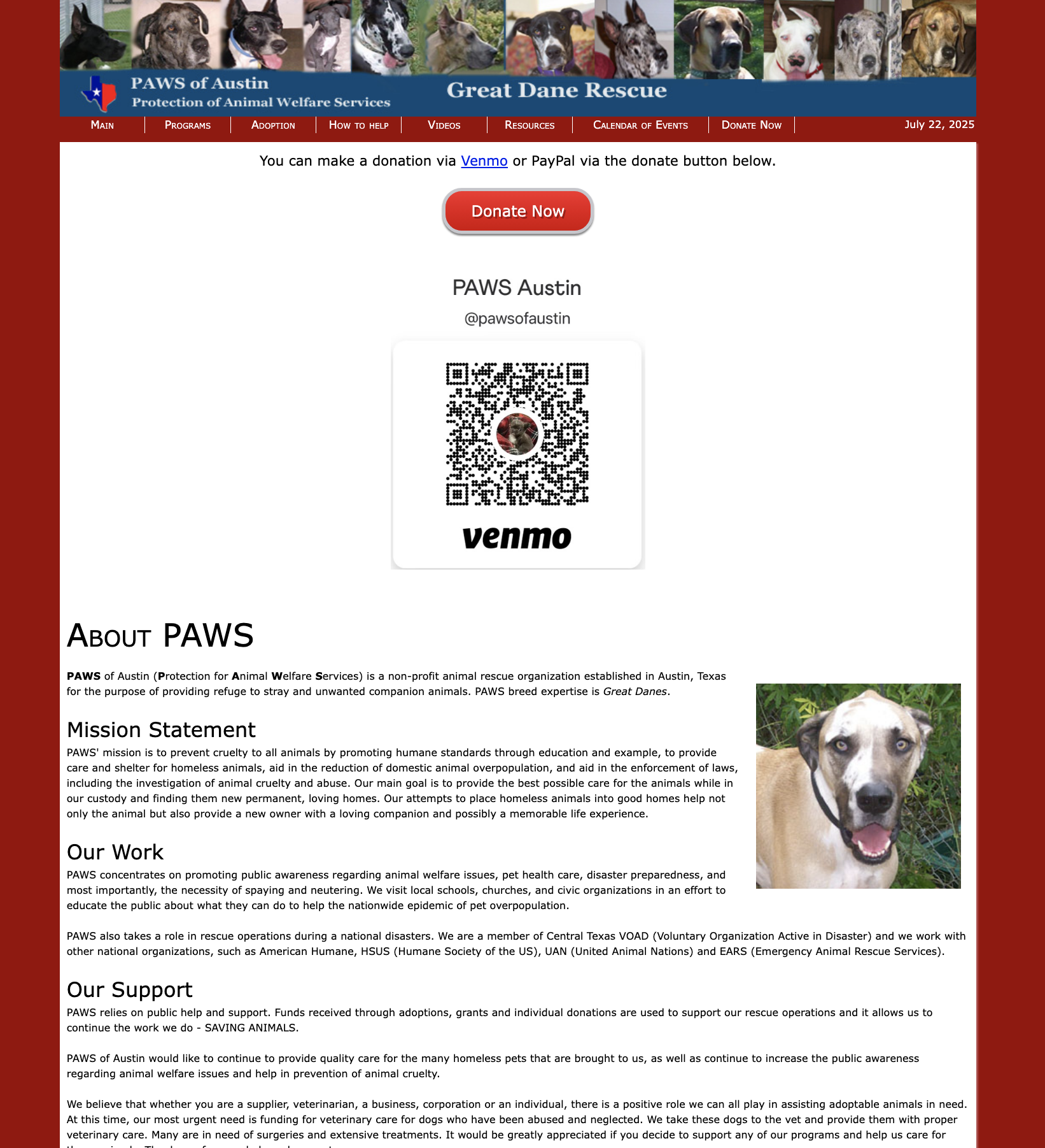
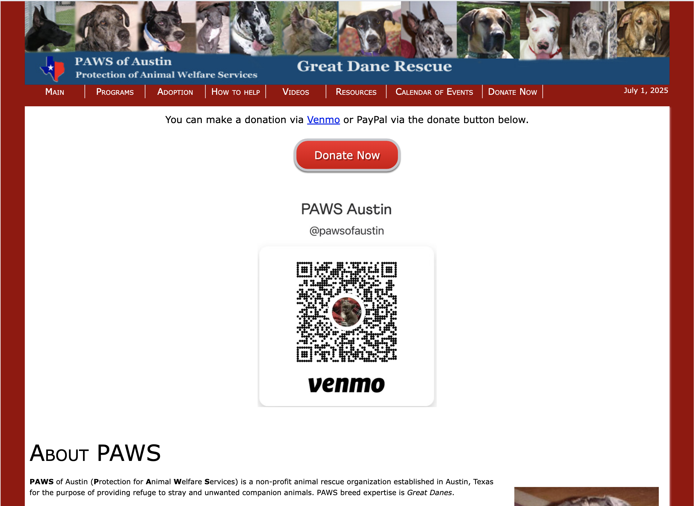
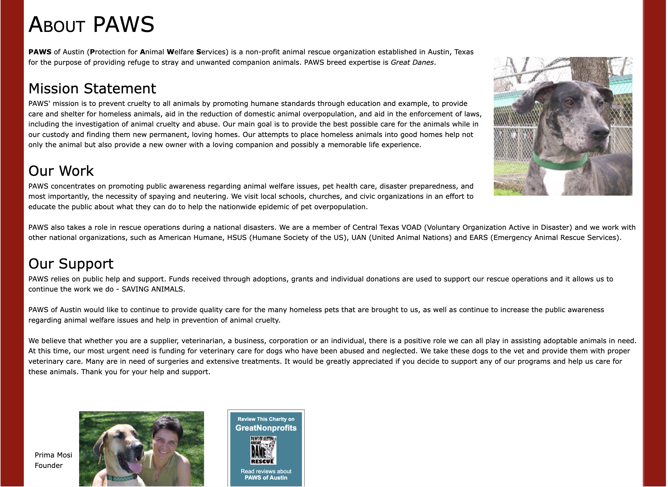
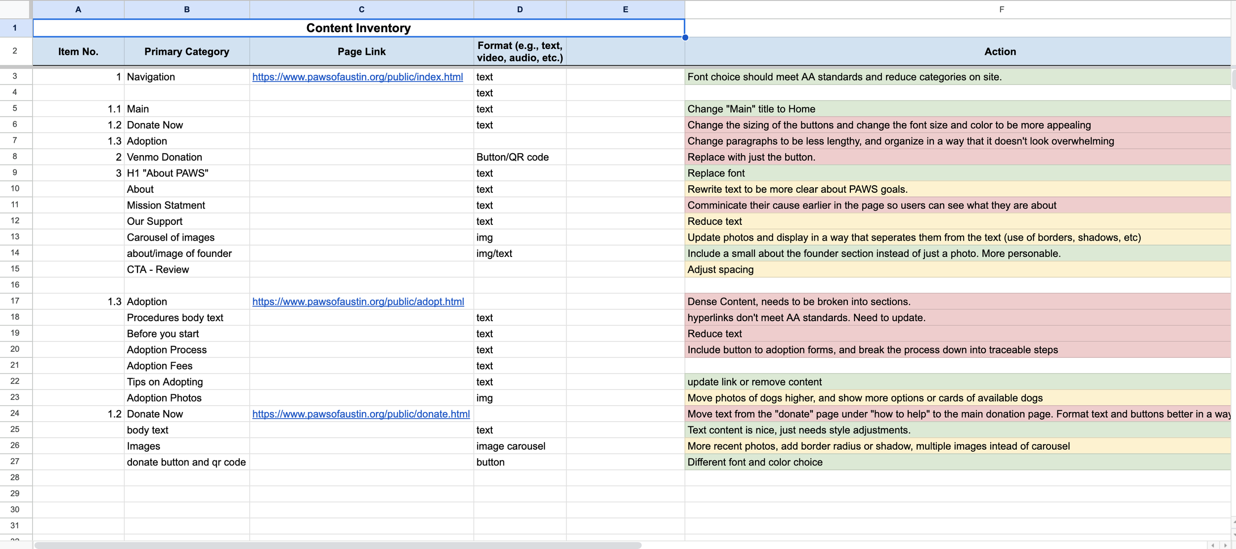
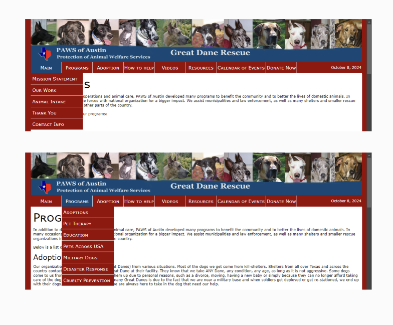
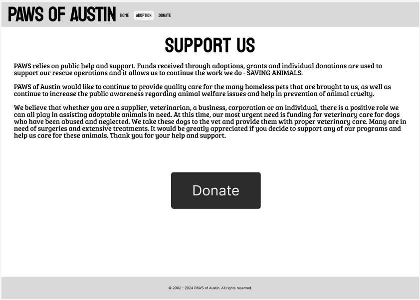
When we initially reviewed the current website, the first thing we noticed was the big red button to donate, along with a Venmo QR code. Following that, users can find more information about PAWS, their mission statement, various work they do, and how they rely on support from their community. While these are their core beliefs, we found that the sizing and content hierarchy don't highlight these values enough, and the important information can get lost in the wall of text.
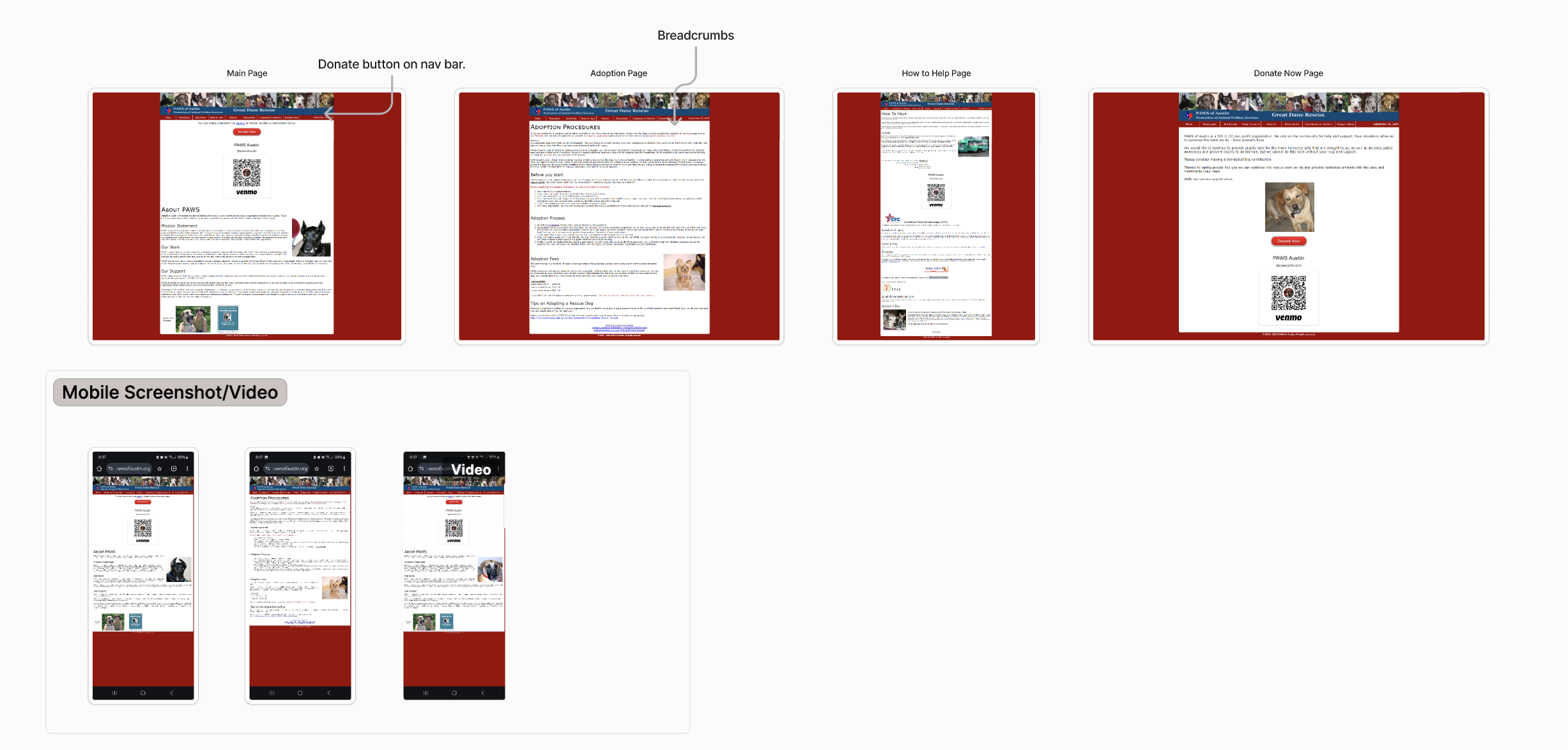
While conducting our Content Inventory of the home page, we noticed a couple of main elements, but the page still looked overwhelming and could make better use of its space. The Navigation Bar has 7 pages, each housing more pages and links, which led to some confusion while finding important pages on the site. Half of the page is text about PAWS, but the text is lengthy and can push users away from reading about their important cause.
During the Content Audit, we made note that PAWS could make better use of their space. Simple changes, such as changing the sizing of buttons and condensing the clunky paragraphs could improve the overall quality and usability of the page and its intent. We suggested changing the typeface to be more consistent, and for the colors of the page to move away from the harsh red and use a more inviting color palette. We wanted to re-group the pages nested within the navigation so users could accomplish their goals of adoption, donation, or finding information easily without having to click through multiple pages to get there.
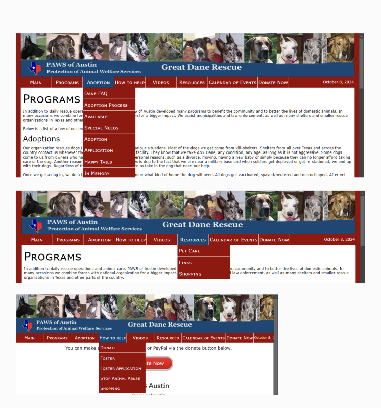
The current sites information architecture leaves much to be desired. With long drop down menus and hard to read text.
Many users in testing found it difficult to find the information they needed in order to complete basic tasks. Overall we found the current architecture to be :
Messy
Disorganized
Too much information
Repetitive Categories
The information with the highest importance is the donation section. Appearing twice on the homepage, both with a high-contrast button and a Venmo QR code. Who PAWS is as an organization is second in importance on its homepage. In four sections on the page, you can learn about PAWS, their mission statement, their work, and their support.
Lastly, a picture of the founder and her name ends the homepage. We found this page lacking in truly showcasing the organization’s values and who they ultimately serve.
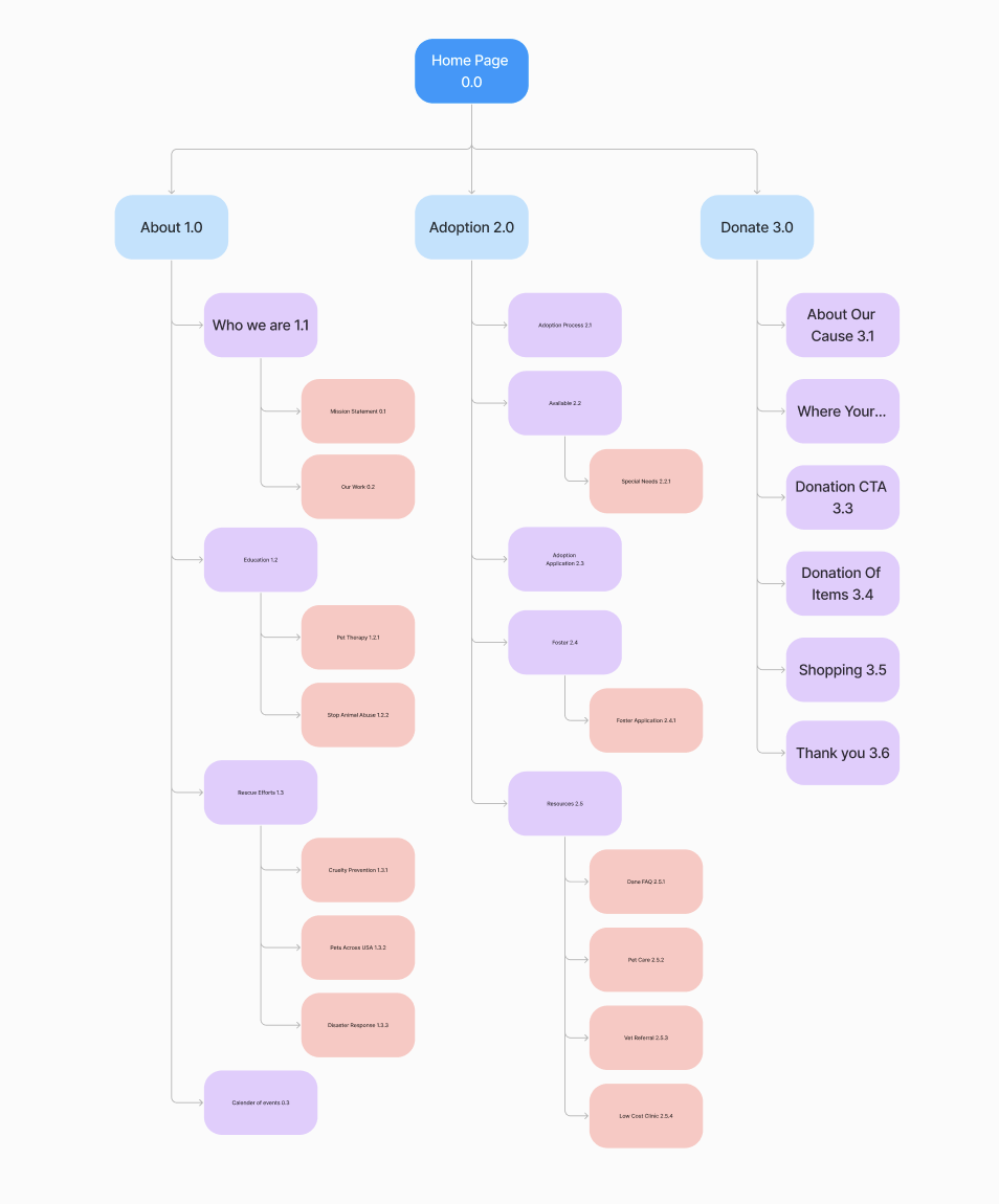
Information Architecture
Lo-Fi Prototypes
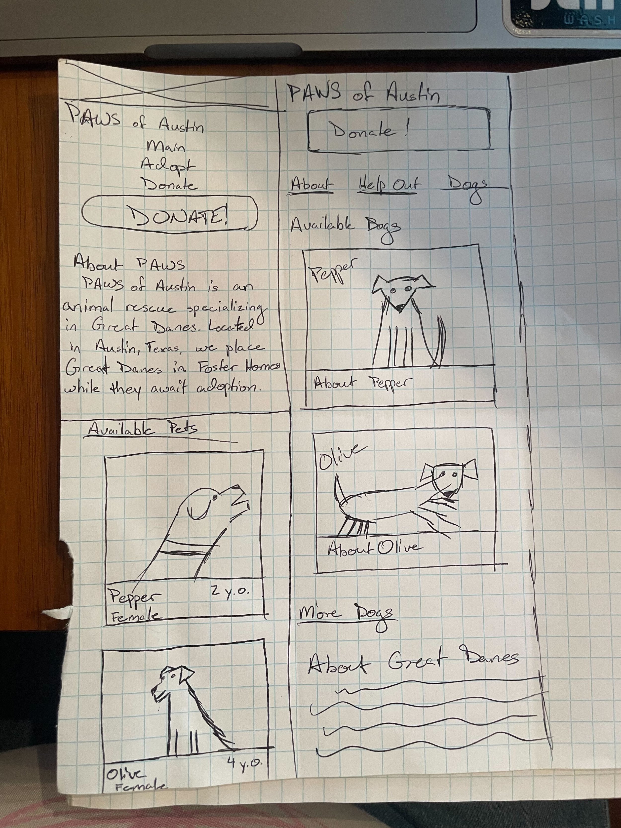
Our low fidelity wire frames were crucial in visualizing the redesign for PAWS of Austin.
By prioritizing simplicity and quick iteration, these prototypes allowed us as designers to focus on core concepts without getting bogged down by details.
Our team started by all creating our own versions of Low-Mid fidelity prototypes. Through that design process we were able to experiment rapidly with different designs and iterations all based around an in stone site map.
Each individual design inspired the final design we worked together to create a user-centered design that effectively addresses user needs and enhances overall usability that the current sire was lacking.
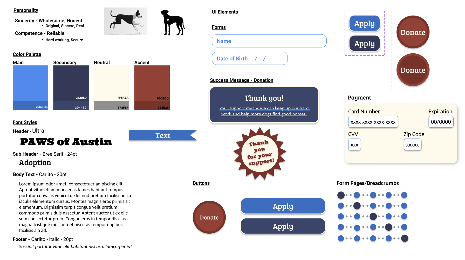
Brand Identity
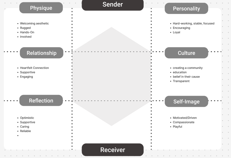
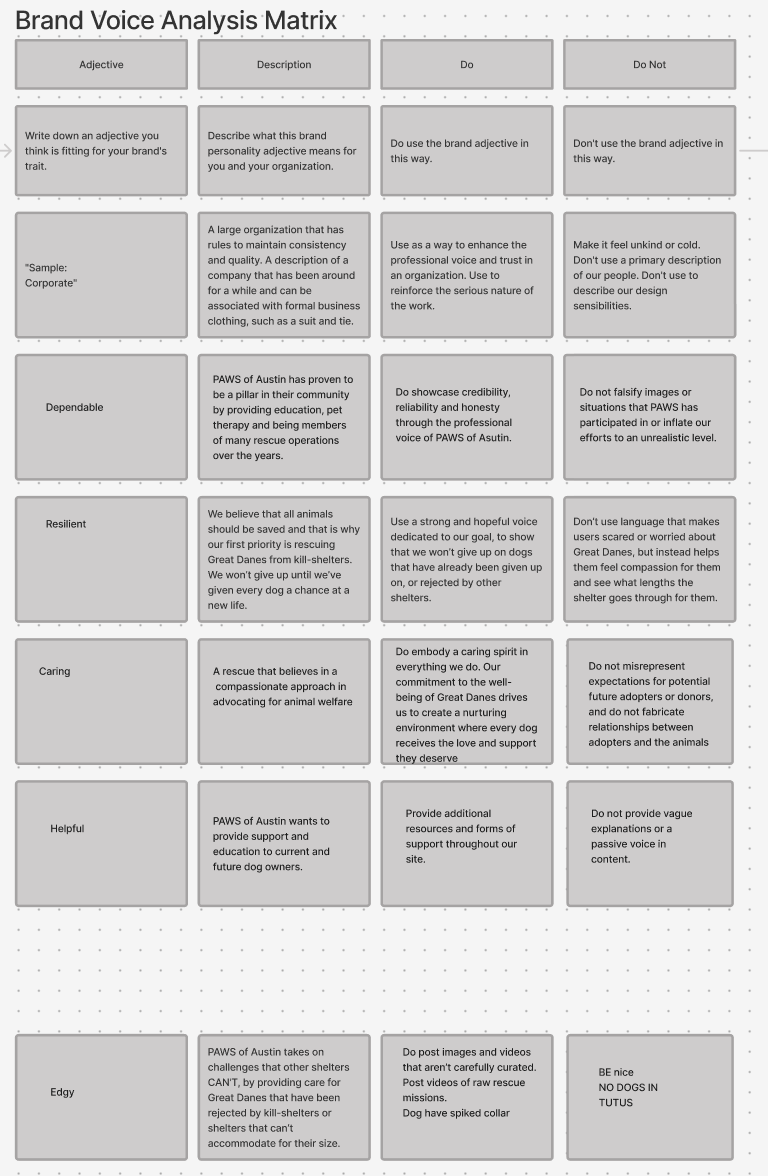
When choosing our brand voice, we wanted something that represented the Gentle Giant nature of Great Danes, as well as characteristics of PAWS as a whole. The Organization fights for what they believe, and goes through great lengths to save all Great Danes, a breed that often struggles in or is rejected by other shelters because they can't accommodate for dogs their size. We want our Voice to be Dependable, showing our reliability and honesty, and Resilient, showcasing the strength and dedication to the PAWS goal.
Visual Identity
When updating the PAWS visual identity, we wanted to keep the same color scheme they did, using the red, white, and blue palette they currently use to represent Texas, but give a more modern yet rustic feel.
The font styles we chose are more playful and have more character, but still maintain a consistent, professional look while allowing users to see how text was organized upon first glance.
We used Ultra for an attention grabbing header, Bree Serif for the sub-header, and Carlito for the body and footer text, which maintained functionality and appeal when using a lot of text.
The use of the neutral cream color is be easier on the eye than the red they currently use, and we use a different shade of red as an accent. Our red reminded us of the strong, resilient characteristics of bricks, a rustic material that stands the test of time. The blues are reminiscent of blue bonnets, the state flower of Texas, and the secondary blue reminds us of the the starry night time skies.
The ribbons and badges are meant to resemble awards at a State Fair.
We also created a responsive version of our mid-fidelity design.
Our original site truly only worked on the desktop version, and had zero mobile capabilities. With this in mind we wanted to create a tablet capable site, because as PAWS advertises, they are often on the go with many of their pet programs. Being able to have a tablet on site at say adoption events they could more quickly gain donations and adoptions on site.
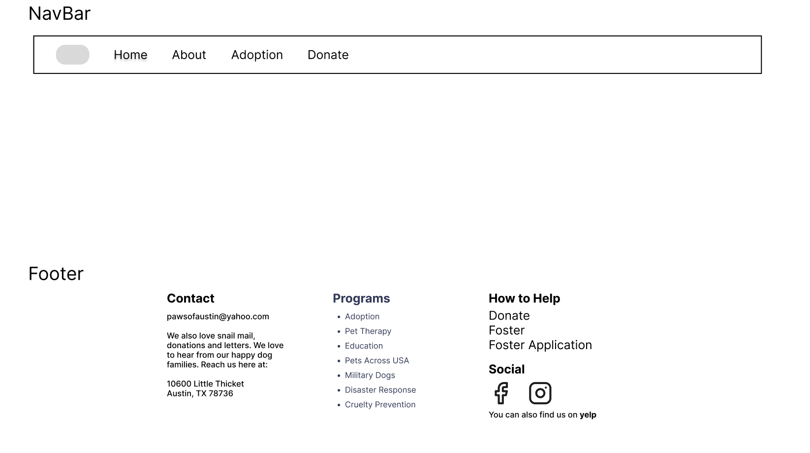
Our team went the route of card sorting with the information from the current sites Information Architecture.
What was a cluttered and site full of drop downs and excessive links we simplified the navigation bar down into 4 sections
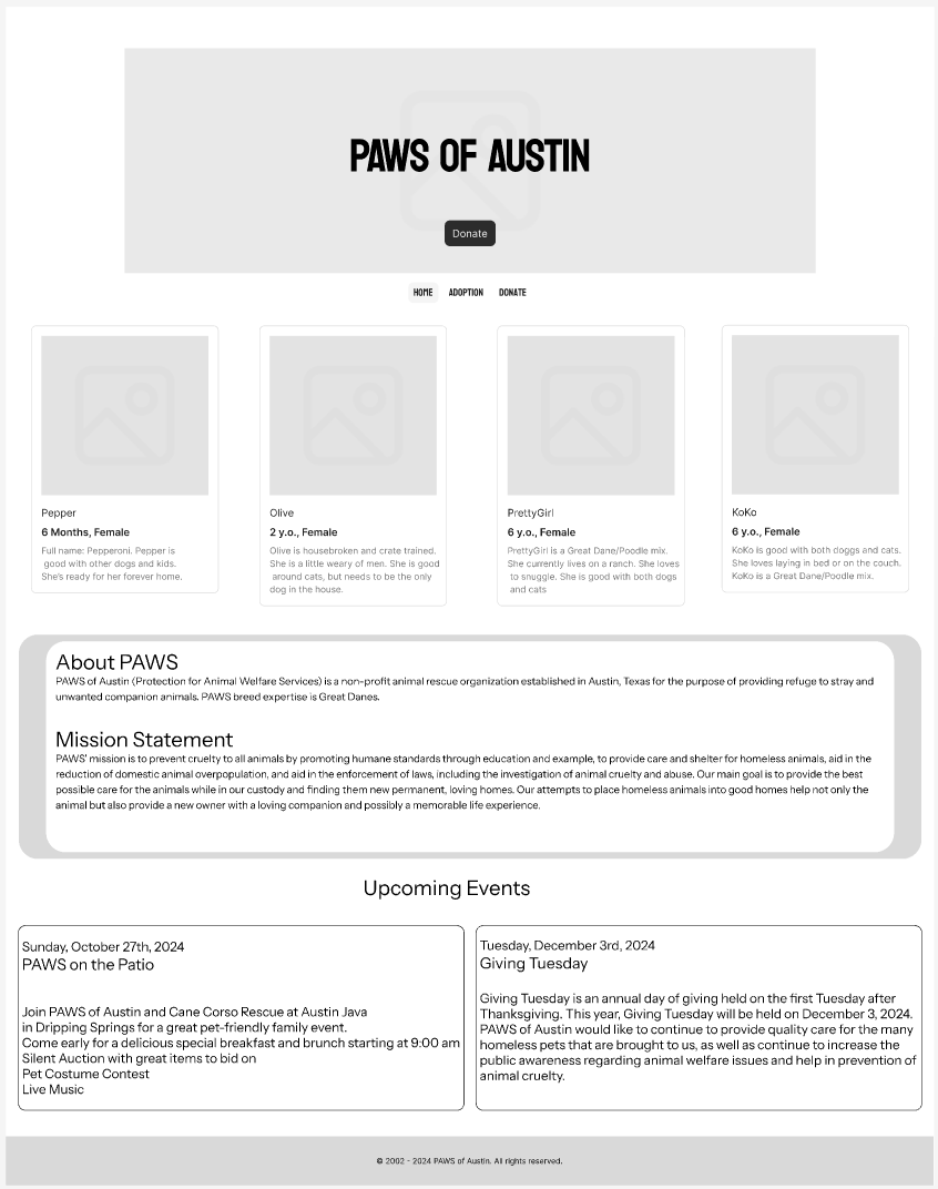
Mid Fidelity Prototypes
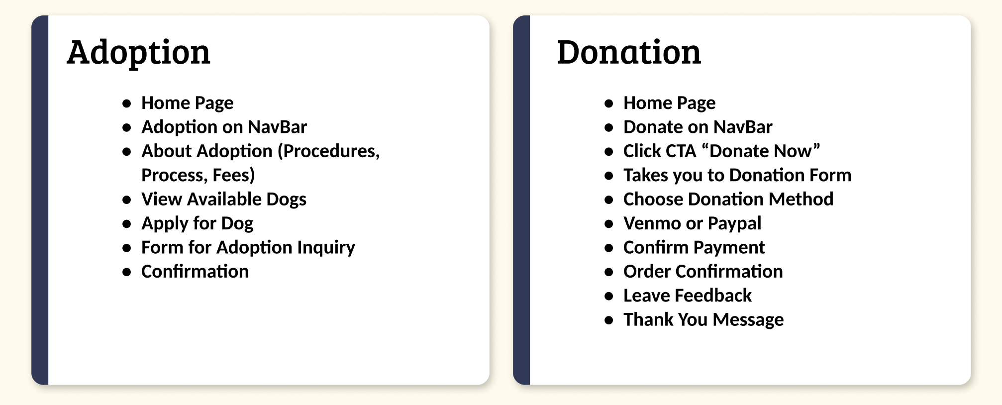
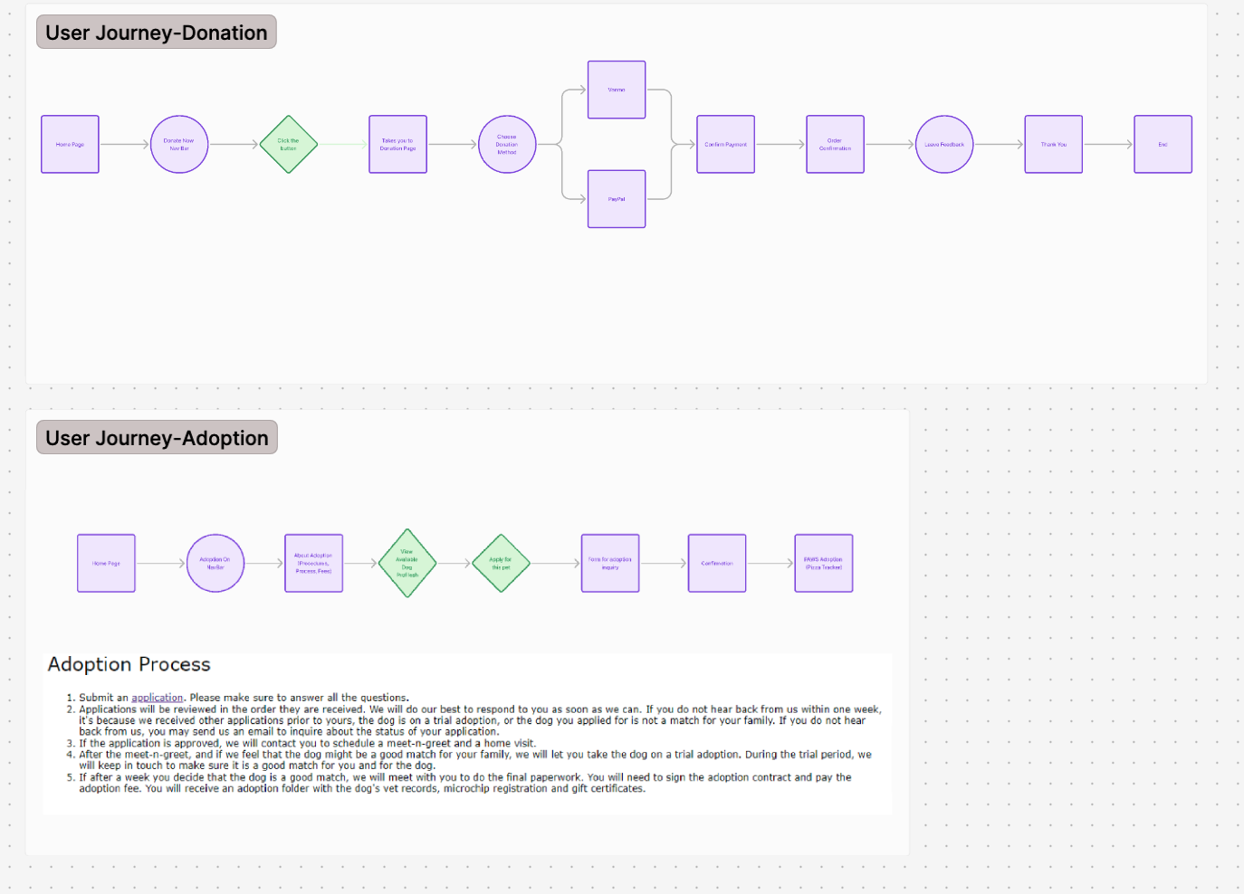
Using our group iterations of the low fidelity options we created 2 pages for our user journey flows, our sites donation and adoption pages.
Our goal with the design was to reduce the depth level of the original site.
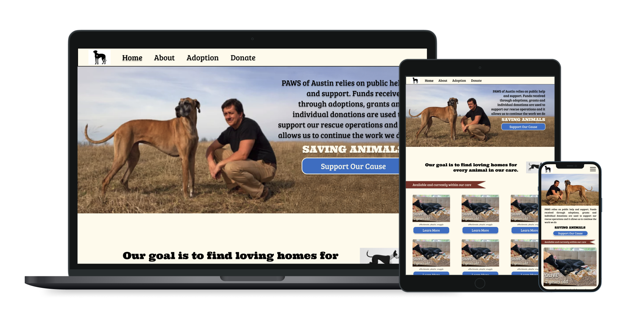
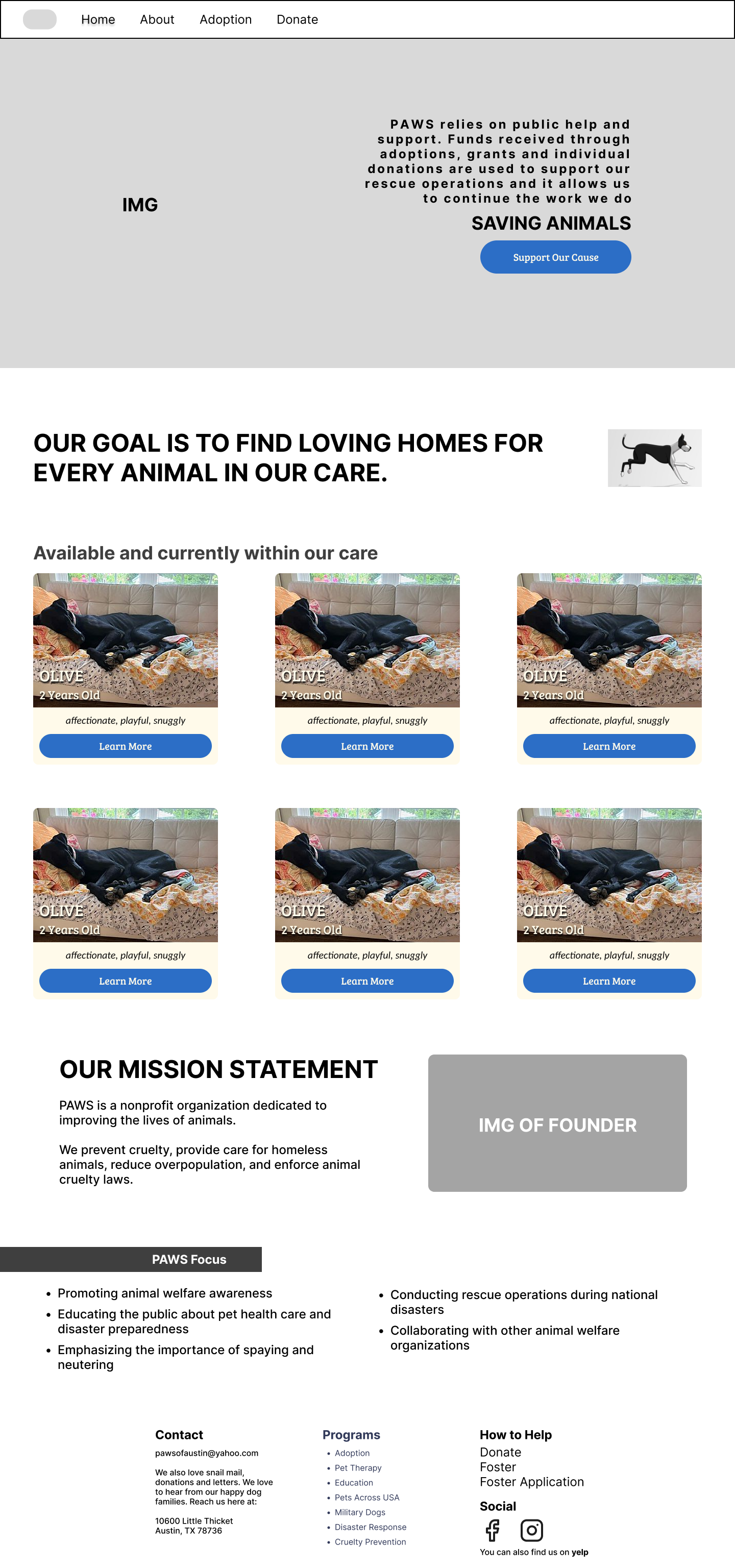
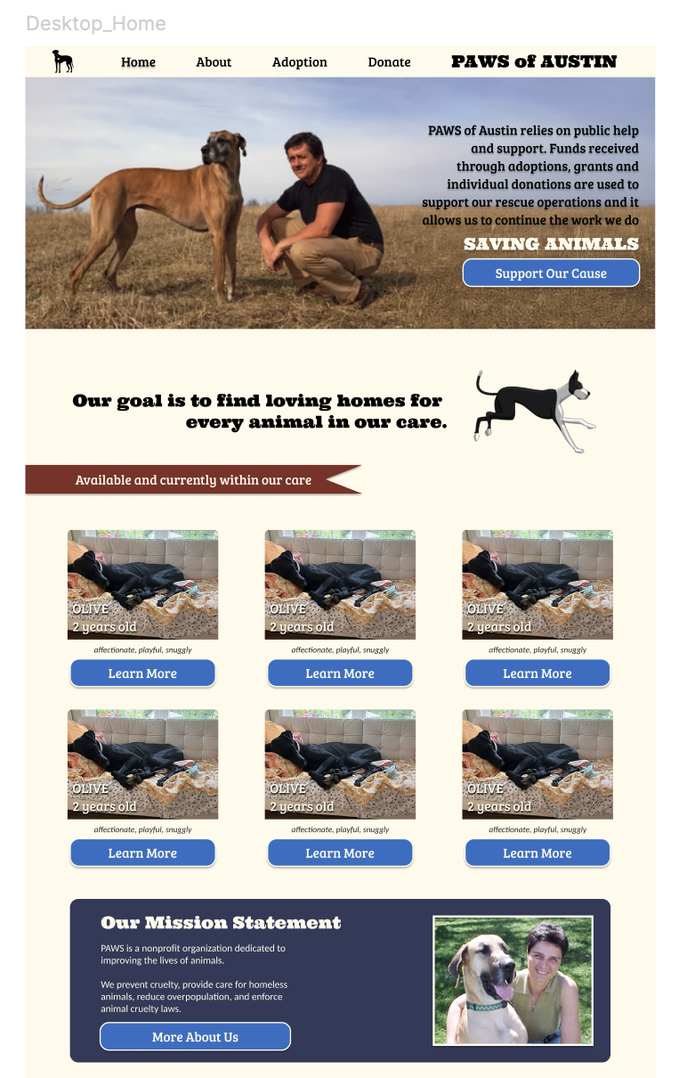
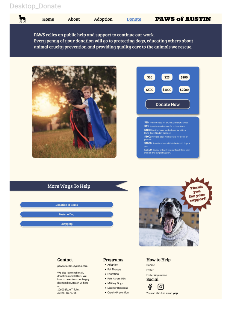
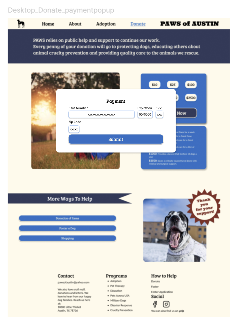
The mid-fidelity prototype for the PAWS of Austin website redesign features a clean, user-friendly layout that prioritizes accessibility and engagement.
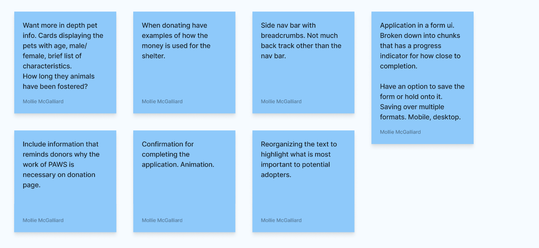
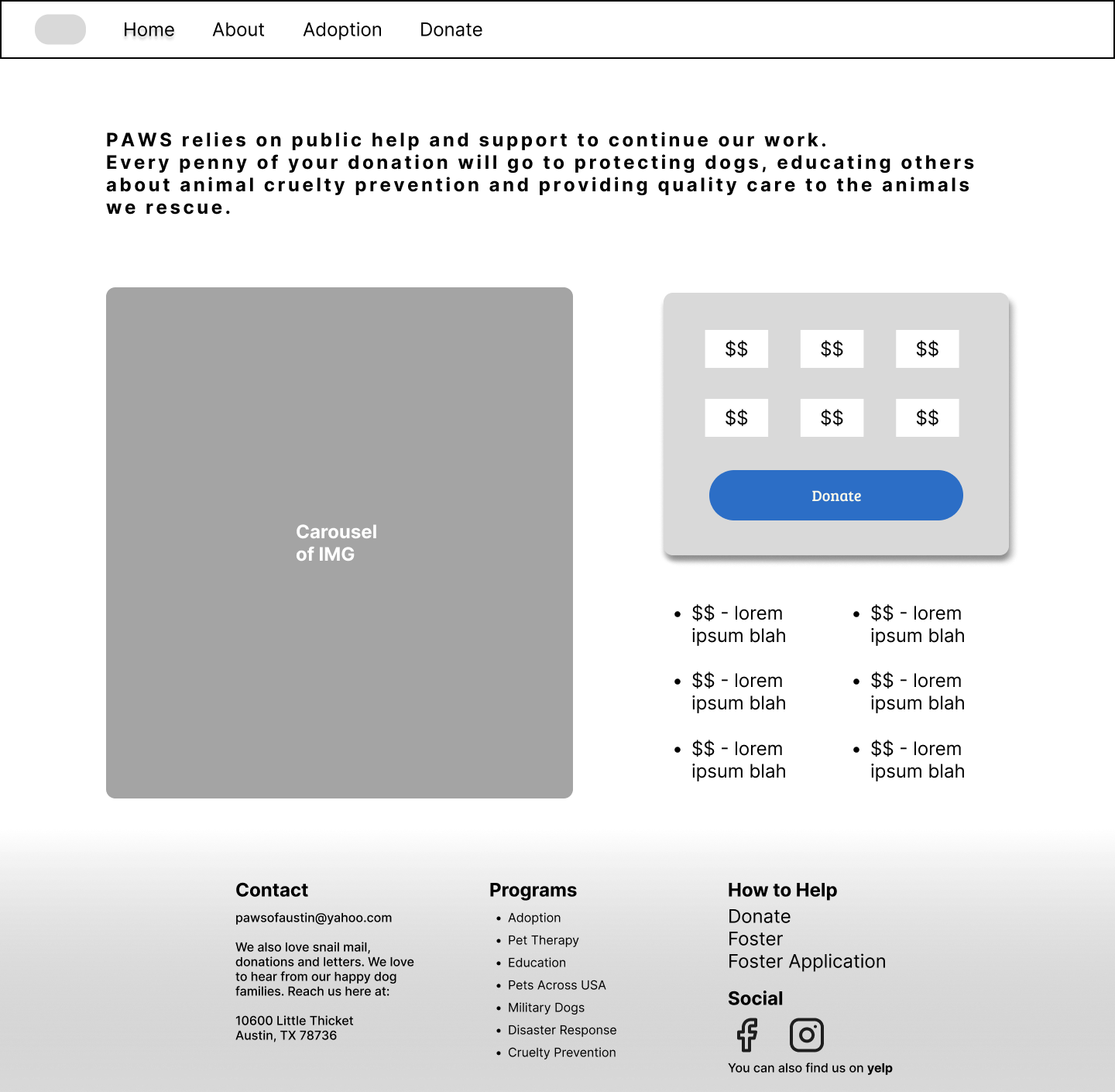
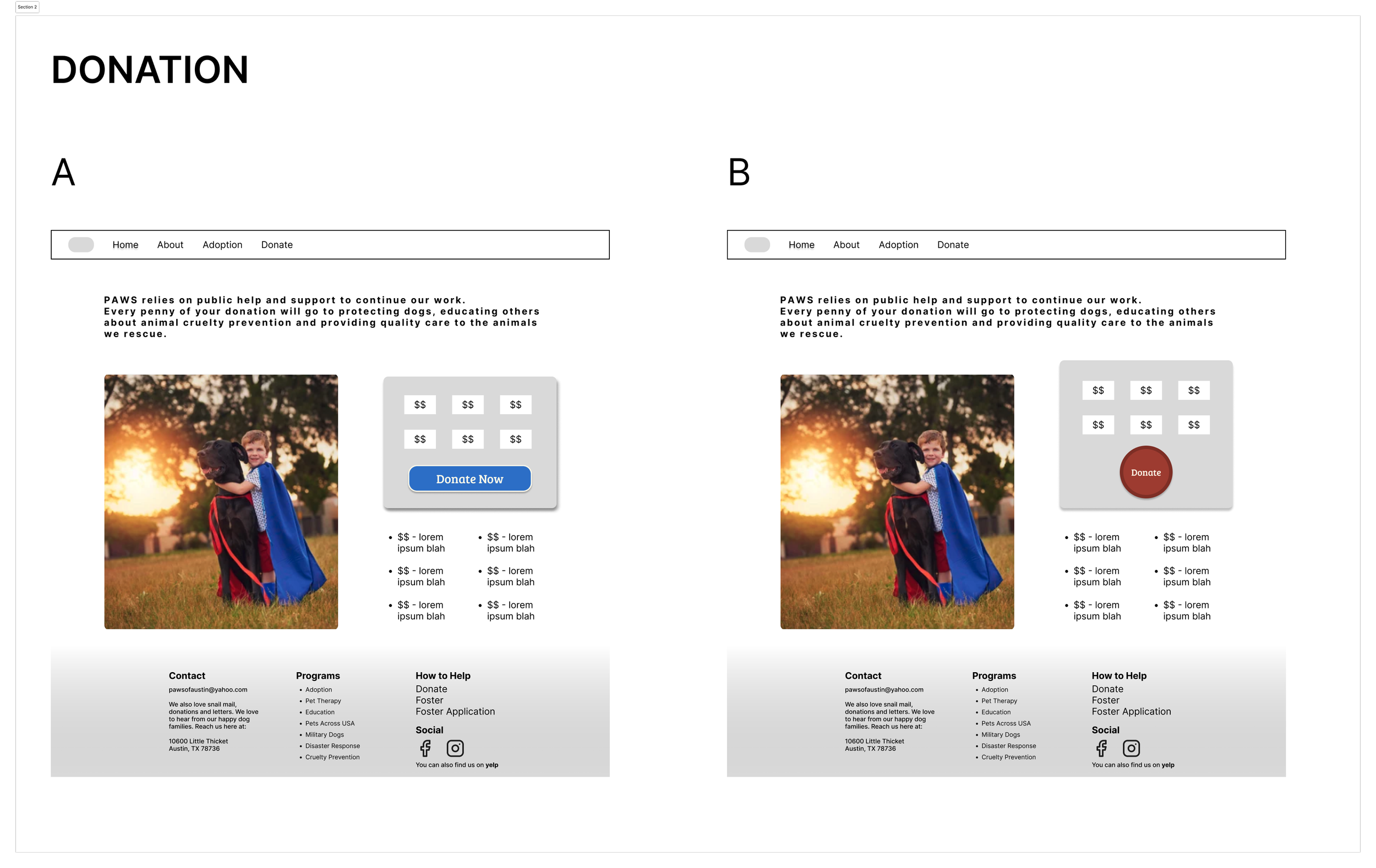
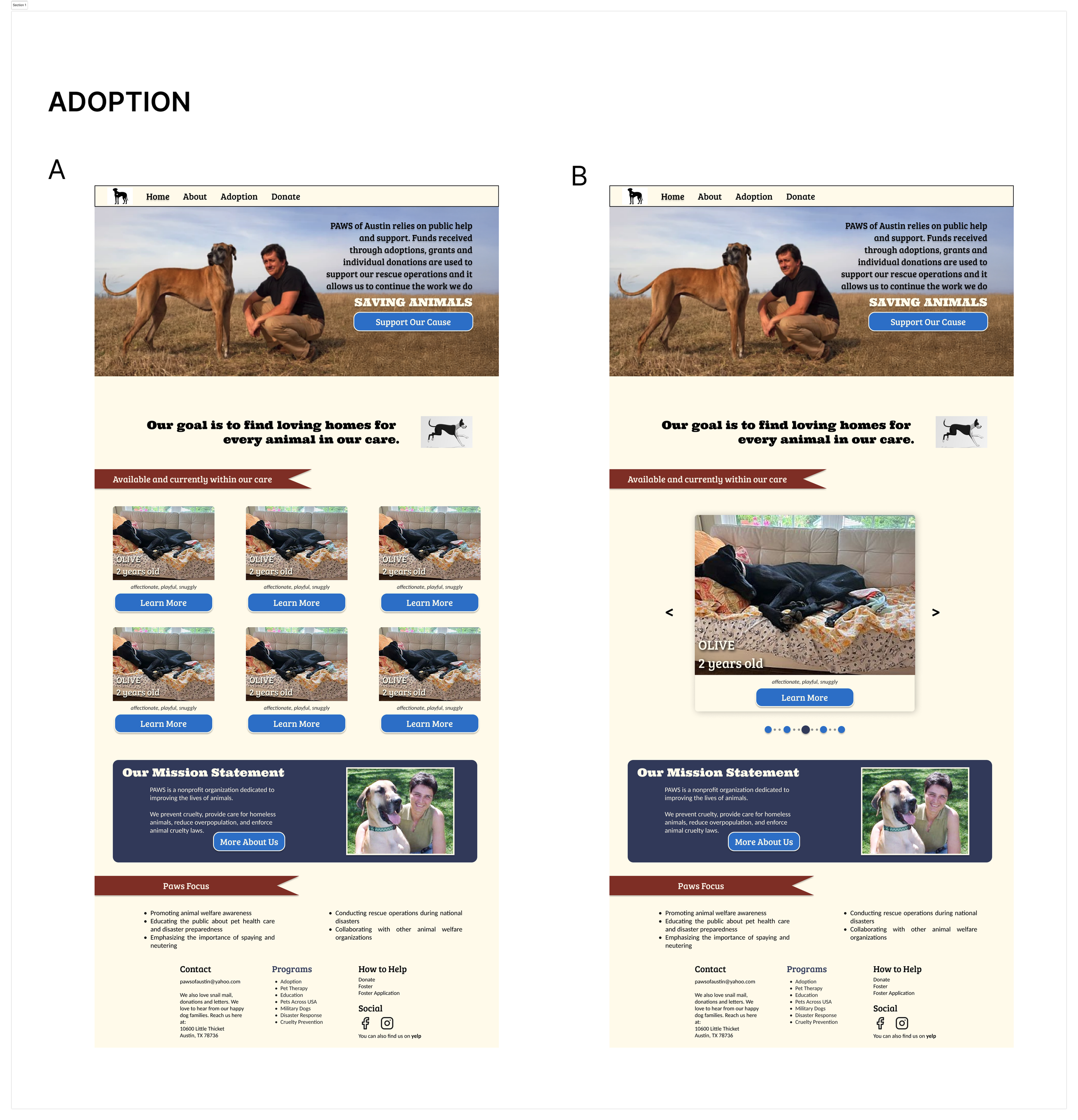
A/B Testing
We had various options to choose from and employed some A/B testing to decide which design path to follow.
Examples were testing a carousel of images instead of adoption cards to determine which option is more appealing to users and testing various donation buttons to identify which design is more appealing and user-friendly including a blue and red one.
Our A/B testing results showed that 57% preferred the homepage without the carousel of images, while 100% of people preferred the blue donation button opposed to the red one.
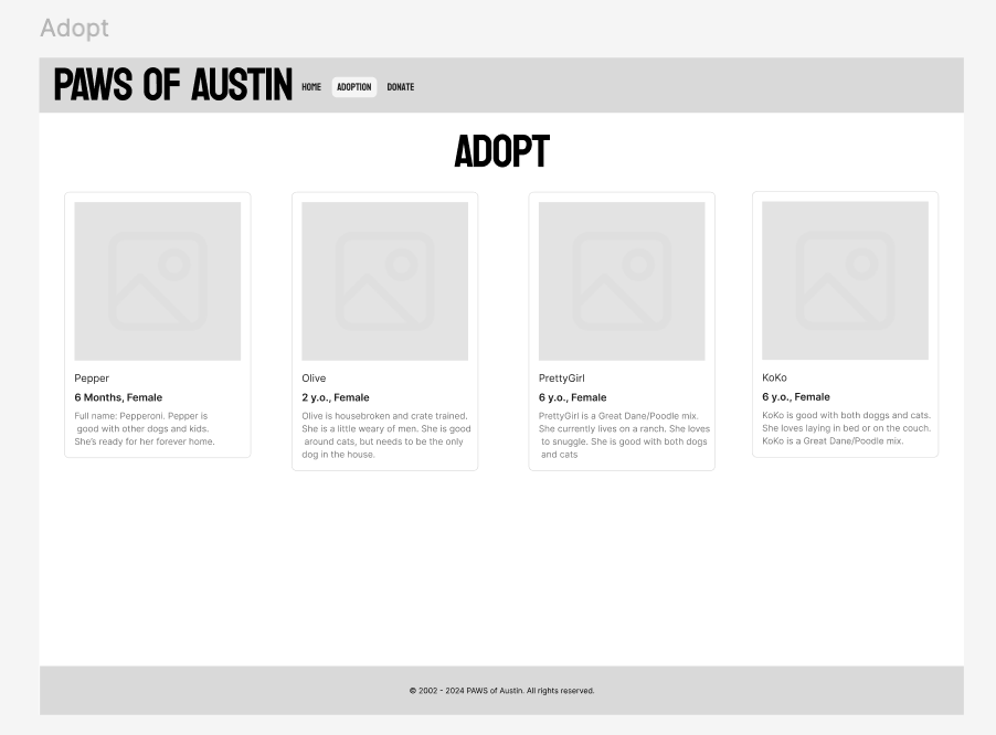
High Fidelity Prototyping
Key Features of our final prototype include
Intuitive Navigation: The redesigned navigation bar offers clear categories, making it easy for users to find information about pet adoption and donations.
Pet Adoption Showcase: A prominent, visually rich section highlights available pets with engaging images and descriptions, encouraging potential adopters to explore further.
Streamlined Adoption Process: The application process is simplified with a step-by-step guide, interactive forms, and helpful resources, reducing barriers for prospective adopters.
Mobile Responsiveness: The design is responsive, ensuring an optimal experience on all devices, from desktops to smartphones, thus reaching a broader audience.
Conclusion
The redesign of the PAWS of Austin website represents a significant step forward in enhancing the user experience for potential adopters and supporters. By prioritizing a modern, intuitive interface, we have improved navigation and accessibility, ensuring that users can easily find information about available pets, adoption processes, and volunteer opportunities
Overall, this redesign not only modernizes the website but also amplifies PAWS of Austin's mission, making it easier for the community to engage, support, and ultimately find loving homes for the animals in their care.